In my Monday Seasons Art Class we learned to use a pallet knife with acrylic paint.
In the first assignment we were instructed to use any colours to explore different pallet knives and what marks you can make. It was only an exercise but it yielded pretty nice results.
For the second assignment we were to use only a pallet knife to paint a shell or sea creature, thinking the sea horse would be easy, that’s what I did. It was difficult to draw something specific with the knife so really not a fan.
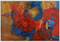
For the final assignment we were to create any abstract we wanted, so similar to the first assignment this red, white and blue abstract was born.
It’s strange because I started taking art classes to train to draw and paint more realistic looking things and what I really like to do is create abstract art. Abstract may be my style, but I’m going to take a drawing class next term to be sure.
Watercolour classes with Karen Pearson were a good opportunity to learn drawing and composition but my watercolour skills didn’t really advance.
To my surprise, in only one of Karen's acrylic painting classes I felt a big improvement. At home, there were a few minor adjustments but for the most part the painting was finished in 3 hours. As always there are things that probably could be perfected but I want to paint something new in her next class.
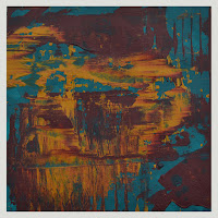
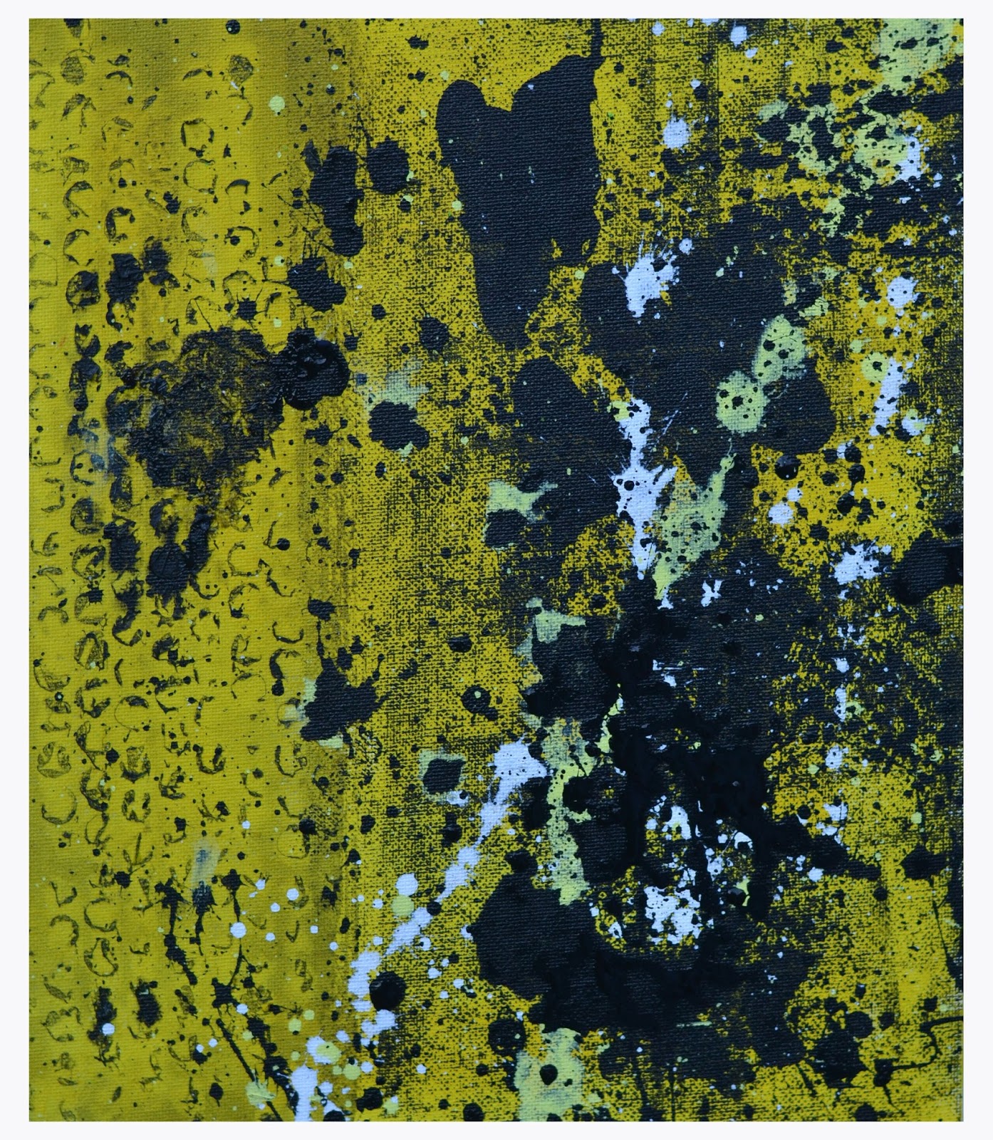
With my sudden addiction to making greeting cards, three art classes, and an almost pathologic need to get through the 50 small painting projects book, I’ve forgotten what I love! Abstract painting… this blog is for you. These two paintings were started about three or four weeks ago and today I was determined to finish them.
The larger one 40cm x 50cm was supposed to be green, yellow, red and black, but as ever I was in a hurry and couldn’t wait for the black to dry. The first layer was really nice but the white of the canvas was showing; more black was added and it covered up some of the good stuff. The green was an acrylic ink and a little watery so when the third layer dried it was very translucent. The final layers were in Jackson Pollock style. I may work on it some more but for now it’s done.
 The smaller one 25cm x 30cm was originally just yellow and black. My husband liked it but I felt it wasn’t finished. Using the JP style, I painted outside in my garden and boy was it cold... but worth it. I love this style of painting because you can always rework it and it’s never wrong.
This landscape exercise in ‘Vibrant Acrylics’ by Hashim Akib was the most difficult for me to date. The colours and composition in Hashim’s painting were somehow difficult for me to apply. This painting was on my easel for over a month and although I reworked sections, I was still not happy with it.
In a moment of clarity or craziness, I decided to try a smaller version on acrylic paper. Disappointed with the brushwork again... I took out my pallet knife and created something prettier than my first version. Can’t wait to start the next painting in the book and hope I have better success.
My 4th study from ‘Abstracts 50 Inspirational Projects’ by Rolina Van Vliet is pure experimentation with mixed media. For this project I used acrylic paint, oil pastels, aluminium foil and a sand & modelling paste mixture. Since it was the first time using aluminium foil, I thought it wasn't bad. It doesn’t look finished, but I’m not sure what’s missing; part of me wanted to drip paint all over it a la Pollock… maybe another time.
Assignment number 3 in “Abstracts 50 Inspirational Projects” by Rolina van Vliet turned out really nice, even though my painting is a slight deviation from the monochrome colour requirements specified in the book.
 To make starting the project easier, I followed the examples in the book and used red with gold outlines. After that, my own colours and marks were used. I had fun with a new tube of Pebeo relief outliner paint and may have gone a little design crazy, but I'm happy with the results. After all it’s my abstract... the book just gave me inspiration.
This study involved working from a figure sketch and drawing it abstractly in ink; even though I took a life drawing class this wasn’t easy. It also required sand, which I couldn’t find, so I used a sand & modelling paste mixture.
 My first attempt didn’t look right because the ink figures weren’t anatomically correct so I started again. The second time wasn’t really successful either, so I cropped the painting and have posted it even though it's not perfect. I enjoyed using the sand mixture and liked the way ink worked with wet paint, but my figures looked funny. It's difficult to get an accurate body shape that is also abstract.
 Rolina van Vliet has done it to perfection in her example on pages 52 & 53 of “Abstracts 50 Inspirational Projects”. This is a method I would really like to explore more.
Initially the fur looked much darker than the example in ‘Vibrant Acrylics’. To lighten it up I added more yellow highlights and probably went a little too far. The large brushes are hard for me to control so I’m using smaller ones and this contributes to the different look. As usual my perspective on the cat is a little skewed; the painting's not perfect and doesn’t look like Hashim Akib’s version in the book, but I still like it anyway.
Besides doing the exercises in "Vibrant Acrylics" and "Ways to learn Acrylics…" I’m now trying out another book by Rolina Van Vliets. "Abstracts 50 Inspirational Projects" has enough lessons to keep me busy; it’s very similar to her other book "Painting Abstracts ideas, projects and techniques" that I reviewed a while ago. This book has 50 studies, each on a different topic with images to use only as a guide. Rolina says it's better if you don’t have images and simply work out of your own imagination. That however, only works in her classes where she can observe and be there to answer questions. She has included some of the paintings from her students and it makes the book more interesting.
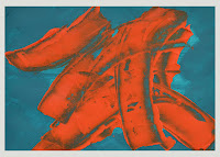
 In the first study ‘Expressive painting style’ the work sequence was not for me; I didn’t like making scratch marks. I made a few changes with a putty knife and dripping paint; obsessed over it for a few days then decided the final painting was pretty good. The assignment was to create a painting that was spontaneous and the stroke directions projected action and variation. I think I achieved that:))
Found an old picture of Lucy after her first visit to the groomer; let me tell you it was a shock. Now her hair is usually short…but not that short.
  |
| B4 Groomer After Groomer |
Tried to keep the painting loose and small so it could be finished quickly…well that didn’t work. After a week trip to the US to see my aunt in the hospital, the painting did take A LOT longer. Although not completely happy with the painting, I've decided it's finished. The portrait was on heavy cardboard so it was easy to adjust the size with a heavy paper cutter. The original image was A4, but after cutting off the bottom, it's now 8"x10". It was great to be able to see what the difference would be in Photoshop before actually cutting it.
As promised, I am working my way through the exercises in the ‘Vibrant Acrylics’ book by Hashim Akib.
 The first exercise ‘Using generous strokes’ was a lesson in making confident marks with big strokes and not overworking the paint. It was tough using a large 2" brush as the artist suggested, so most of the painting was done with a 1" short flat. The background colour was process magenta & titanium white; the example in the book had a lot more of the background showing. It was also hard not to overwork the painting… but for my first try it wasn’t a total disaster.

The second exercise ‘Let’s Paint’ was a still life image using strong primary colours. The background was made with cadmium orange & titanium white. Again I had trouble using the large 2" brush, so mostly the 1 1/2 “, 1” & ¼” flat brushes were used. It was difficult to draw the images with a paint brush and I found my perspective and size of the elements not quite right. When completed, though, I did like the final painting and enjoyed the process.
Both images were painted on sheets from Blick Studio canvas pad size 16" x 20", bought while in NYC. Hashim's instructions were to use 24" x 18", but I'm not sure it would change my mind about the 2" brush. Painting larger and with heavy body acrylics is different and really enjoyable; some day I'll try a larger canvas.
 In this class we worked with colour pencils but most of my time was spent drawing the butterfly...should have traced it. Indelible ink pen was used for the dark bits and the colour pencils for the rest. I couldn't get the colours dark enough so this was one of my least favourite assignments... but it did give me ideas.
At home, I had a play with A2 watercolour paper, my watercolour pencils and a few oil pastels. Watercolour pencils, for me are nicer than colour pencils. With watercolour pencils you can wet the drawing and get all kinds of cool effects. Pastels were used to add more layers to the drawings; it was nice because those marks weren't affected when wet. I liked the overall effect much better and probably won’t be using colour pencils in the near future.
The watercolour pencils and oil pastels are a lot of fun and I’m going to try and use them more.
In Wendy's class we had a sample of flowers to paint and we could do either a real or abstract painting. I decided to paint an abstract because a real life painting, even though small, would take me forever. We learned about painting backgrounds and then letting it show through. You were not supposed to leave the under painting showing, but I did and bright pink was the result.
At home I played in photo shop to see if any improvement to the painting could be made.
 The only adjustments I decided to make were to fix the flower petals, brighten the yellow and add more layers to the background. On the background another layer of magenta was glazed over, then neon red was added to darken it some more. Not sure if these changes made much difference, but I had no further inspiration. Thought about adding butterflies; but didn't have the energy to work on this painting anymore. Will file it away and possibly work on it another day.
 |
| In Class |
In Wendy's art class we learned to do loose watercolours with masking fluid, salt, pins and ink, or, in my case, white gouache. The assignment was in the SAA March 2015 magazine.
Everybody did the same thing but we all had unique results; it was a really great experience. Not everyone used the same hues and even if the colours were the same, the intensity was different.
 |
| At Home |
I loved it and decided to do another at home using different colours and a lighter weight cold pressed paper.
To learn more about acrylics I enrolled in a 10 week acrylic painting class for beginners at Surrey Adult Learning Centre. My instructor was Joel Wareing and the class had a variety of people all interested in art. In the first class we did exercises learning mark making and different painting techniques.
Assignment 1 - paint with two colours using different techniques, for example: washing, blending, stippling, sponge and palette knives. Since I was late to the class and didn't complete the assignment I haven't shown it. Not my fault... there are so many buildings; I got lost and was traipsing around in the rain lugging all my art stuff. If you knew me, you would be laughing your head off right now.
 Assignment 2 - to draw with a pencil and paper listening to different types of music. We were to make marks on the paper according to what we were feeling. The exercise was really neat, you may even be able to tell from the marks what types of music was played.
 Assignment 3 - From the 1st assignment choose a technique, from the 2nd a type of mark making. Then combine these on A3 paper. I liked the result and it was completely random.
The assignments were really well thought out and helped everyone to be free and creative. I really enjoyed the class.
While browsing through the books at WH Smith ‘Painting Realistic Abstracts’ by Kees van Aalst it looked interesting. When purchasing it on Amazon, however I accidentally bought ‘Painting Abstracts, Ideas, Projects & Techniques’ by Rolina van Vliet, which turned out to be the better of the two.
‘Painting Realistic Abstracts’ mostly had examples of watercolour paintings and I wanted to work with acrylics. This book will come in handy in the future. The artist Kees Van Aalst is truly gifted and provides lots of examples of what makes a painting good; but doesn’t explain the how to. This book will be useful after I have more painting experience and know more about watercolour techniques.
‘Painting Abstracts, Ideas, Projects & Techniques’ by Rolina Vliet is an excellent book, it has tons of information about everything. Each chapter has a different subject with explanations and exercises to go with it. For every project there is an explanation on theme/emphasis, picture element, composition, materials, technique, work sequence, tips and variation exercises. The examples they provide are interesting and beautiful, unfortunately my experiments didn’t come out as nice. Taking notes on what worked and what didn’t for future projects is the right way to go. The exercises in the book are broken down into five sections; Primary Picture Elements, Secondary Picture Elements, Composition, Technique and Material, Theme and Project.
Primary Picture Elements- Exercises 1-5
 1 Expressive Shapes – design a surface divided by spontaneous lines, apply colours roughly with a pallet knife. My first try there were too many colours, it looked like a child drew it. The second was using only neutral colours and I liked it better. The third used only three colours, and turned out the best.
 2 Variations in shape – don’t think this exercise was properly done, but I liked the outcome.
3 Geometric shapes – didn’t like the way the two paintings came out. The first had a black background and the colours on top were not saturated enough so the back showed through. The second was using tape to get clean lines, but the tape didn’t pull up correctly. Probably should have included an example but it's too embarrassing.
4 Free shapes using oil pastel crayon – did three only one came out half way decent. Again too embarrassed to include pictures.
 5 Spontaneous shapes – painting in layers, start with an underpainting and let it dry. Using only two or more colours these paintings were pretty successful.
The first was with cadmium orange and modelling paste over turquoise, a third colour wasn’t necessary.
The second was with turquoise, yellow ochre and burgundy, square instead of landscape.
Did a few others and liked them as well; the spontaneous shapes study is my favourite so far.
Colour - Exercises 6-11
6 Mixing with colour blending – used cobalt blue, primary yellow and paynes grey, painting was very dark looking and it was difficult to blend colours. I didn’t like this exercise.
7 Mixing with a palette knife – the first painting came out muddy, the second I used a scrapper to pull colour off and it looked nicer but not great. Sorry once again...no photos.
You would think I would have a handle on colour after reading the book on it, but for some reason the colour chapter was not working for me. I got discouraged and stopped doing the exercises.
There are a great many things to learn in this abstract book and when I get my confidence back I will carry on. That should be a t-shirt 'Lost confidence just CARRY ON anyway'. It really is fantastic and one of the best I have bought so far. I would highly recommend Painting Abstracts, Ideas, Projects & Techniques’ by Rolina van Vliet. Look for more exercises from this book in future blogs.
Last year at Surrey Artists’ Open Studios, was a screen printing taster class, which was full. But luckily, advertised in the SAOS guide was an afternoon ‘Adventures in Screen Print’ class with Helen Locke, so I took it. She said to bring an image or object for inspiration. I chose Duck, Duck, Goose for my theme. In class we cut out our shapes with a sharp knife.
Then we agreed on colours and put down the background; it’s easy but complicated at the same time. You’ll just have to try it to see what I mean.
After the background dried, the cut out was next… kinda hard to get everything lined up properly.
Luckily Helen was there for us.
And voila my first screen print you also get a ghost copy.
It was a fun class and I would take it again. It would be nice to buy all the stuff and do at home but without the proper space it could get very messy. Also, all the paint mixtures were done for us and Helen was there helping us put things in the right order and giving colour advice. Also, I can’t even remember exactly how I did it.
B&Q had a clearance sale on house paints and they were really bright colours. It was a no brainer, the bargain shopper in me bought 5 colours: blue, green, red, yellow and black Maybe not the wildest of colours but with them I created two really cool paintings using techniques learned from Art Fusion.
For more ideas I searched abstracts on Google images and found some interesting art. This time regular artist acrylics were used because the B&Q ones were too close to the original. By changing the colours, shape and adding paint splashes, I created my own artwork. It’s nice to view other paintings to get ideas provided you don’t create an exact replica.
I have included the inspirational painting; couldn’t find the link to the photo but found Victor Tilson the artist @ www.saatchiart.com. That's something to remember, keep the link to images you download.
Since the books from Tuesday's blog didn’t help, the next logical step was the internet. YouTube is a great way to learn things without leaving your home. There are a lot of abstract painters using different tools and techniques; but after each attempt my results were unsuccessful. Two YouTuber’s I do recommend are Amy Pierce and Sabine Belz, they do interesting artwork but difficult to recreate.
While searching the net I came across Art Fusion Productions by Glen Farquhar; can’t forget a name like that. Art Fusion , based in Australia, has videos you can purchase with step by step instructions. Either buy a DVD and wait, or download the videos immediately. I bought and downloaded six and have been successful with three. The other three tutorials were useful for technique but no pleasing paintings came from it.
‘Blizzard’ was my favourite, with two awesome paintings now hanging in the bedrooms. Unfortunately the house paint was too diluted and starting to crack so they will have to be redone.
‘Dandelion’ is in the hall
and ‘Patchwork’ in the conservatory.
After creating these paintings I felt like they weren’t me; so having tried books and the internet, the next phase will have to be art class.


 The smaller one 25cm x 30cm was originally just yellow and black. My husband liked it but I felt it wasn’t finished. Using the JP style, I painted outside in my garden and boy was it cold... but worth it. I love this style of painting because you can always rework it and it’s never wrong.


 To make starting the project easier, I followed the examples in the book and used red with gold outlines. After that, my own colours and marks were used. I had fun with a new tube of Pebeo relief outliner paint and may have gone a little design crazy, but I'm happy with the results. After all it’s my abstract... the book just gave me inspiration.
 My first attempt didn’t look right because the ink figures weren’t anatomically correct so I started again. The second time wasn’t really successful either, so I cropped the painting and have posted it even though it's not perfect. I enjoyed using the sand mixture and liked the way ink worked with wet paint, but my figures looked funny. It's difficult to get an accurate body shape that is also abstract.
 Rolina van Vliet has done it to perfection in her example on pages 52 & 53 of “Abstracts 50 Inspirational Projects”. This is a method I would really like to explore more.

 In the first study ‘Expressive painting style’ the work sequence was not for me; I didn’t like making scratch marks. I made a few changes with a putty knife and dripping paint; obsessed over it for a few days then decided the final painting was pretty good. The assignment was to create a painting that was spontaneous and the stroke directions projected action and variation. I think I achieved that:))


 The first exercise ‘Using generous strokes’ was a lesson in making confident marks with big strokes and not overworking the paint. It was tough using a large 2" brush as the artist suggested, so most of the painting was done with a 1" short flat. The background colour was process magenta & titanium white; the example in the book had a lot more of the background showing. It was also hard not to overwork the painting… but for my first try it wasn’t a total disaster.
 In this class we worked with colour pencils but most of my time was spent drawing the butterfly...should have traced it. Indelible ink pen was used for the dark bits and the colour pencils for the rest. I couldn't get the colours dark enough so this was one of my least favourite assignments... but it did give me ideas.


 The only adjustments I decided to make were to fix the flower petals, brighten the yellow and add more layers to the background. On the background another layer of magenta was glazed over, then neon red was added to darken it some more. Not sure if these changes made much difference, but I had no further inspiration. Thought about adding butterflies; but didn't have the energy to work on this painting anymore. Will file it away and possibly work on it another day.


 Assignment 2 - to draw with a pencil and paper listening to different types of music. We were to make marks on the paper according to what we were feeling. The exercise was really neat, you may even be able to tell from the marks what types of music was played.
 Assignment 3 - From the 1st assignment choose a technique, from the 2nd a type of mark making. Then combine these on A3 paper. I liked the result and it was completely random.
 Liz went through a quick lesson in colour mixing; then we used cut-outs of images of autumn that she asked us to bring. My two paintings came out pretty nice and the afternoon was really enjoyable.


 1 Expressive Shapes – design a surface divided by spontaneous lines, apply colours roughly with a pallet knife. My first try there were too many colours, it looked like a child drew it. The second was using only neutral colours and I liked it better. The third used only three colours, and turned out the best.
 2 Variations in shape – don’t think this exercise was properly done, but I liked the outcome.
 5 Spontaneous shapes – painting in layers, start with an underpainting and let it dry. Using only two or more colours these paintings were pretty successful.


