In 'Painting Daily' Carol talks of letting a painting go if it’s not working; this week I’m finding that difficult. Maybe it’s because my friend asked me to paint her dog, or maybe it’s because it doesn't look right. So far three days are gone and instead of letting go…I’m procrastinating. In her book, Carol explains that if you don't like something it could be the composition; not sure that's it. It's probably the crap drawing. In my haste to paint, I haven’t really worked on getting the image drawn correctly and it’s cost me 3 days. So with a heavy heart I'm calling it quits on this painting. Next time more time needs to be dedicated to drawing; or for expediency the image could be traced.

Previously, I painted my brother’s dog in an abstract style and wasn’t impressed. This time it was going to be more photo realistic...well that was the plan. Using cyan blue, process magenta and white I built up the colour to try and reflect the hair. It didn’t work, and after obsessing over it for a while, I tried adding some pastel...but that didn’t work either. With four days already lost… it has to be deemed finished.
My Samoyed's were such fantastic dogs it’s sad that they are no longer with me, but I have some great photos to paint from. This was going to be a quick painting but I did spend two days on it. Even if the painting could be improved, this week’s lesson learned has to be… don’t obsess and let it go. I will live to paint another day and hopefully keep learning.
Joel asked us to bring three colours, plus white to art class (process yellow, cyan and magenta or cadmium red, cadmium yellow and cobalt blue). Of course, I brought all six and had a play with both sets. The colour wheel was as you’d expect; but the exercise after was pretty neat.
 We were to make a grey background using the three colours then paint one of the white objects on the table in various shades of grey. My grey background wasn’t really grey, but I liked it anyway. It was hard for me to draw the object and see all the shades, but with a little help from Joel I did it.
Painted two objects from the kitchen at home and liked the results; even if the background wasn’t grey.
 Then painted my white Samoyed from an old picture. Didn’t finish it because I didn’t want to ruin it. Note to self... have to get out of that mind-set.
While browsing through the books at WH Smith ‘Painting Realistic Abstracts’ by Kees van Aalst it looked interesting. When purchasing it on Amazon, however I accidentally bought ‘Painting Abstracts, Ideas, Projects & Techniques’ by Rolina van Vliet, which turned out to be the better of the two.
‘Painting Realistic Abstracts’ mostly had examples of watercolour paintings and I wanted to work with acrylics. This book will come in handy in the future. The artist Kees Van Aalst is truly gifted and provides lots of examples of what makes a painting good; but doesn’t explain the how to. This book will be useful after I have more painting experience and know more about watercolour techniques.
‘Painting Abstracts, Ideas, Projects & Techniques’ by Rolina Vliet is an excellent book, it has tons of information about everything. Each chapter has a different subject with explanations and exercises to go with it. For every project there is an explanation on theme/emphasis, picture element, composition, materials, technique, work sequence, tips and variation exercises. The examples they provide are interesting and beautiful, unfortunately my experiments didn’t come out as nice. Taking notes on what worked and what didn’t for future projects is the right way to go. The exercises in the book are broken down into five sections; Primary Picture Elements, Secondary Picture Elements, Composition, Technique and Material, Theme and Project.
Primary Picture Elements- Exercises 1-5
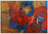 1 Expressive Shapes – design a surface divided by spontaneous lines, apply colours roughly with a pallet knife. My first try there were too many colours, it looked like a child drew it. The second was using only neutral colours and I liked it better. The third used only three colours, and turned out the best.
 2 Variations in shape – don’t think this exercise was properly done, but I liked the outcome.
3 Geometric shapes – didn’t like the way the two paintings came out. The first had a black background and the colours on top were not saturated enough so the back showed through. The second was using tape to get clean lines, but the tape didn’t pull up correctly. Probably should have included an example but it's too embarrassing.
4 Free shapes using oil pastel crayon – did three only one came out half way decent. Again too embarrassed to include pictures.
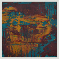
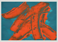 5 Spontaneous shapes – painting in layers, start with an underpainting and let it dry. Using only two or more colours these paintings were pretty successful.
The first was with cadmium orange and modelling paste over turquoise, a third colour wasn’t necessary.
The second was with turquoise, yellow ochre and burgundy, square instead of landscape.
Did a few others and liked them as well; the spontaneous shapes study is my favourite so far.
Colour - Exercises 6-11
6 Mixing with colour blending – used cobalt blue, primary yellow and paynes grey, painting was very dark looking and it was difficult to blend colours. I didn’t like this exercise.
7 Mixing with a palette knife – the first painting came out muddy, the second I used a scrapper to pull colour off and it looked nicer but not great. Sorry once again...no photos.
You would think I would have a handle on colour after reading the book on it, but for some reason the colour chapter was not working for me. I got discouraged and stopped doing the exercises.
There are a great many things to learn in this abstract book and when I get my confidence back I will carry on. That should be a t-shirt 'Lost confidence just CARRY ON anyway'. It really is fantastic and one of the best I have bought so far. I would highly recommend Painting Abstracts, Ideas, Projects & Techniques’ by Rolina van Vliet. Look for more exercises from this book in future blogs.
My next project with Jane @ www.ashleybrianart.co.uk was of my Tibetan Terrier Lucy. I always loved Warhol’s style and decided to create a pop art type painting next. Lucy is adorable and with the perfect photo, it was inevitable she would be my subject.
Photoshop helped me to adjust the image, using Filter/Artistic/Cutout and then playing with: No. of levels, Edge simplicity and Edge fidelity.
After doing that project, which took nearly six weeks, I realized starting with my lightest colour first would have been easier. Adding the orange over the blue and purple was tough, even though I was working with acrylics.
To test this theory I made a smaller pop version of a Giraffe and as expected, it was easier to do. However, it probably needs a second coat of red.
Since the books from Tuesday's blog didn’t help, the next logical step was the internet. YouTube is a great way to learn things without leaving your home. There are a lot of abstract painters using different tools and techniques; but after each attempt my results were unsuccessful. Two YouTuber’s I do recommend are Amy Pierce and Sabine Belz, they do interesting artwork but difficult to recreate.
While searching the net I came across Art Fusion Productions by Glen Farquhar; can’t forget a name like that. Art Fusion , based in Australia, has videos you can purchase with step by step instructions. Either buy a DVD and wait, or download the videos immediately. I bought and downloaded six and have been successful with three. The other three tutorials were useful for technique but no pleasing paintings came from it.
‘Blizzard’ was my favourite, with two awesome paintings now hanging in the bedrooms. Unfortunately the house paint was too diluted and starting to crack so they will have to be redone.
‘Dandelion’ is in the hall
and ‘Patchwork’ in the conservatory.
After creating these paintings I felt like they weren’t me; so having tried books and the internet, the next phase will have to be art class.


 We were to make a grey background using the three colours then paint one of the white objects on the table in various shades of grey. My grey background wasn’t really grey, but I liked it anyway. It was hard for me to draw the object and see all the shades, but with a little help from Joel I did it.

 Then painted my white Samoyed from an old picture. Didn’t finish it because I didn’t want to ruin it. Note to self... have to get out of that mind-set.
 1 Expressive Shapes – design a surface divided by spontaneous lines, apply colours roughly with a pallet knife. My first try there were too many colours, it looked like a child drew it. The second was using only neutral colours and I liked it better. The third used only three colours, and turned out the best.
 2 Variations in shape – don’t think this exercise was properly done, but I liked the outcome.
 5 Spontaneous shapes – painting in layers, start with an underpainting and let it dry. Using only two or more colours these paintings were pretty successful.


